A guide to selecting a designer and communicating your business’s logo needs.
You own a business, and business is booming! Things are going so well, you find yourself saying: “Now is the time to take action and improve my businesses' brand and identity.” And to do that, you need a logo.
So you hunt around for a bit, and you find some designers that can help. But what do you do after that? You’re a business person with a company to run, which means you almost certainly don’t have time to dive into learning advanced principles of graphic design and constructing a logo. What questions should you ask to communicate your wants and needs? What should your logo's design achieve? For the logo design process to run successfully, you'll need to know the answers to those questions.
Thankfully, this blog post exists to do just that. Below, I’ll discuss what to look for in a logo design, and what separates a good logo from a GREAT logo. Furthermore, I'll share some insights on the design process, and how to select the right designer to work with your business.
First Things First: What is a Logo?
Logos can come in several different forms: a simple icon, a wordmark, a lettermark, a combination mark, or an emblem.
- Icon – An abstract and stylized visual representation of a company.
- Wordmark – A uniquely stylized text, spelling out the company’s name.
- Lettermark – A typographic symbol, usually the company's initials.
- Combination Mark – A logo combining wordmarks and symbols for maximum flexibility.
- Emblem – An icon and wordmark encased within a design.
Here are some examples of all the different types of logo’s listed above.

As you probably already know, the value of a logo is that it creates an instantly recognizable symbol that makes a business' products or services instantly recognizable. But what is it that really makes a GREAT logo stand out from a merely good logo?
In many cases, the difference between good and GREAT boils down to following basic principles of graphic design:
- Clarity – Is the logo's message clear and legible?
- Contrast – Is there a contrast between typeface/font and color?
- Color – Does the color scheme match the spirit of your business?
- Unity – Do the element all fit together?
- Refinement – Has the logo been polished to perfection? Or does it still look like a rough draft?
- Versatility – Can the logo be used in different ways, and successfully applied to different types of products?
Many of these points may seem self-explanatory. But when you're looking through the portfolios of potential logo designers, asking these questions about their work is an important part of the selection process. If you want a GREAT logo, a designer’s work should reflect a deeply ingrained understanding of these graphic design basics. Remember, you’re trusting your designer (or designers) to create a symbol that represents your business, one that will be plastered onto your company's products and property. The logo they turn in needs to be great, and it needs to make you excited to share it!
"...the value of a logo is that it creates an instantly recognizable symbol that makes a business' products or services instantly recognizable."
Logo Style: Two Basic Categories
Now that we’ve covered the basics of what to look for in a logo, it's time to consider style. SInce everyone has their one personal sense of style and how a logo should look and feel, this element of design is a highly subjective one that mostly comes down to personal preference. That being said, I like to sum up the different styles of logo design with two distinct categories.
Illustrative & Minimalist
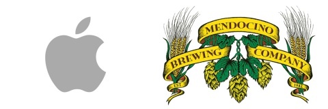
To give a pair of examples: Apple’s Logo (Minimalist), or Mendocino Brewing Company’s Logo (Illustrative).

Both styles of logo have their strengths and weaknesses, both of which I will address below:
Illustrative logos are more about artistic expression than anything else. Businesses such as microbreweries love this style of graphic design because of the high contrast, extreme colors, and product unity extension. But Illustrative logos can also be problematic, considering how often they ignore other graphic design basics such as clarity, refinement, and versatility. This style of logo often tends to reflect the characteristics of its creator, rather than the spirit of the business it's supposed to represent.
Minimalist logos are the safer option, and in most cases will be the better of the two. Minimalist logos typically follow all the basic graphic design elements we discussed above: they're easy to read; have appropriate contrast, integrated colors, and a unified design; are refined and, most of all, are highly versatile. They may not be as loud as your typical Illustrative designs, but Minimalist logos are usually much more memorable, as the choices in their creation tend to have greater purpose beyond simply being art for art's sake.
To elaborate: think of all the most recognizable logos in the world. Nike’s is a simple swoosh. Shell is… well, a yellow shell; yet we all know it represents a gas station. All of these logos succeed because of their minimalist style and highly refined design. Their simplicity makes them easy to remember and, most importantly to the businesses they belong to, instantly recognizable.
The Key to a Great Logo Design: Versatility!
The example logos we discussed above (Nike, Shell) follow all the required principles of basic graphic design. In particular, they all excel at what may be the most important logo design principle of all: versatility. A logo that is truly versatile can be used on products in any medium (web, print) with ease; as such, versatility is a vital part of creating a GREAT business logo. Accomplishing this level of versatility is much easier with a Minimalist logo than with an Illustrative one.
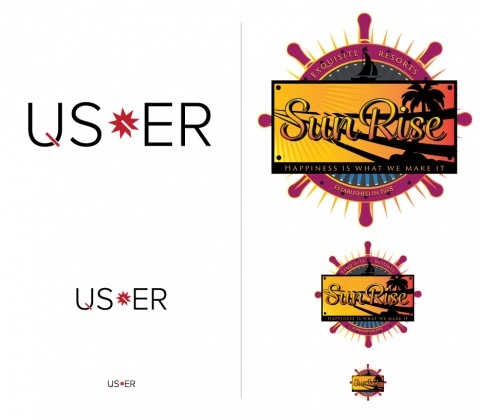
Consider the following: On the left, we have a Minimalist logo, while the logo on the right has an Illustrative style.

Notice how the logos' clarity and contrast are affected by their size. The Minimalist design maintains its clarity and recognizability no matter its size, while the Illustrative design becomes muddled and unclear as it gets smaller.
Now let's look at what happens when we apply the logos to a picture.

The Illustrative logo struggles to fit the overall aesthetic, its loud colors creates visual tension between logo and picture. The Illustrative logo design competes with the picture and dominates the audience's attention, while the minimalist design blends in a way that allows the picture to be seen first, with the logo being a secondary element that provides further information.
Furthermore, consider how your logo can be further utilized as an element of branding. For a real world example of how a logo can have additional applications, let's look at look at how Coach incorporates a portion of their logo as branding on their products.

Notice how on the handbag above, the capital "C" from "Coach" (which also resembles a horseshoe) is used as a visual design element that gives the bag its unique look, while also establishing it as a part of the Coach brand at the same time. When sticking with a rather simple, Minimalist logo, it's easy to manipulate elements of said logo and transform them into supporting brand imagery. Illustrative logos, on the other hand, are often a struggle to break down into recyclable parts. If Illustrative logos are allowed to become too complex, it can cause a breakdown in graphic design unity, compromising your business' identity.
Final Thoughts: In the Real World, Minimalist Logos are King.
There's a reason Minimalist logos are the kings of the graphic design industry. I say this from personal experience; for several years now, I've worked as a graphic designer for EvenVision, a web design and marketing firm. In that time, I've seen how companies that use minimalist logos are able to establish more cohesive and unified brand identities, largely thanks to their logos being versatile and easy to break apart and use as unified branding elements. Furthermore, Minimalist logos can be used across more platforms, thanks to their ability to be re-scaled with ease. Thus, businesses are able to utilize their logos to their fullest potential, and by doing so give their company an instantly recognizable face.
I think you're starting to get the picture. Minimalist logos are king because their versatility. That being said, there benefits to using an Illustrative logo, as well. Ultimately, any variety of logo has he potential to work, depending on what kind of business you run, and what you require from your logo. But at the end of the day, the biggest difference between a good logo and a GREAT logo is the last basic fundamental of graphic design - versatility.

